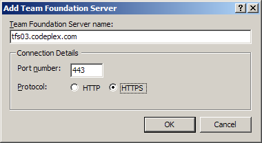
Let us make the UI complex, just because we feel like it
Let us take a look at this dialog, shall we?
What I see is that we have two text fields and two checkboxes, in a fairly big dialog, to express the following bit of information:
I honestly have no idea what the purpose of this is. To make it harder to input the information, presumably. Given a URL, I now need to split it apart manually, I need to know that https is usually on 443, etc.
It also mean that when I am talking to a user, I need to give her three pieces of information, and explain where to put each of them, rather than sending a URL that she can just copy / paste in place and be done with it.


Comments
Some level of intelligence should be required to operate a computer.
We require a driver license for a car for instance :)
SG,
That is not an excuse to create bad UI.
The purpose of UI is to make it easy.
Well yeah, but one of the reason why you say this dialog is bad is because it requires you to tell "a user" three pieces of information instead of one. I assume an office secretary won't be the one responsible for adding TF servers... You are whining about nothing now Ayende.
Looks like the dev who did that UI took the easy way to validate the input.
Also, your combobox example omits the port override option.
laimis,
It bothers me, when I have to do string manipulation to give this a URL instead of just giving it a URL.
In addition to that, I know of quite a few people who save most of everything in source control. Anything from documents to pictures to presentation to email.
Yes, Joe User will use this kind of stuff
Brent,
That is because the port option is NOT NEEDED in this scenario. It is implicit to the https protocol used.
Can't a person define a different port for https on their server?
Yes, they can, in which case you use the following:
https://myserver:8344
The one that's always killed me is the dotted-ip control. It violates all of your expectations, not the least of which are the broken select all and clipboard support.
I agree, the UI looks like it was created by a moron and doesn't help reveal intent.
Another nitpicky thing is the selection of HTTP or HTTPS. HTTPS I would assume would default the port to 443 and HTTP to 80, but it doesn't if you keep flipping it around. PITA to tab back to re-enter the port if you make a mistake.
The dropdown works. Just let me type it in since I know where I'm going (and keep history of the past few of them much like how TortoiseSVN works now).
BTW whoever did create feel free to email me and bash me, I'm sure I did some stupid interface in my past life that I'm ashamed of.
I don't know, Ayende, can you imagine an enterprise IT department just entering a URL? Too simple, no certification needed.
I think it just need a little bit of improvement. One way to do it is to do exactly what Oren has said. I'll also keep the Connection detail box however I probably will hide it using a collapsible panel. This mean a user doesn't have to see or use it if they don't want to however the option is there and for them to explore it. Secondly whatever is set in the option box will automatically reflect into the URL. Users will catch on into this and eventually wouldn't even need to use Connection Details setting.
Ori: Yeah, I believe there was a question about it on one of the MCPD tests..... :P
"I need to know that https is usually on 443"
if you are a "developer" and you don't know that... well... I have issues with you being a developer on the first place
If you want usability buy an Apple.
=)
I have to agree with Oren on this. I've dealt with dialogs like this and they are completely frustrating. In most cases (or maybe ALL cases) the user of this dialogue will be given the TFS connection information as a single URL. I've rarely seen URLs given out like this:
Host: tfs03.codeplex.com
Port: 443
SSL: Yes!
I'll echo what Bil said though, I'm sure I've developed some UI catastrophes in my time, but I try not to repeat them. :-)
User interfaces like these help the user understand what he's doing, instead by simply going with the hard uri.
This is less error prone since the user has more actions (served) to take (and this is surely harder I agree...) but has longer time to think about what he's doing. This benefits Joe.
This is a pita for repetitive work, but adding TFS servers, should normally not be repetitive work so they might have chosen this.
Just my cents :-)
(sorry if my English is bad)
Comment preview