What is new in RavenDB 3.0Operations–Optimizations
One of the important roles operations has is going to an existing server and checking if everything is fine. This is routine maintenance stuff. It can be things like checking if we have enough disk space for our expected growth, or if we don’t have too many indexes.
Here is some data from this blog’s production system:
Note that we have the squeeze button, for when you need to squeeze every bit of perf out of the system. Let us see what happens when I click it (I used a different production db, because this one was already optimized).
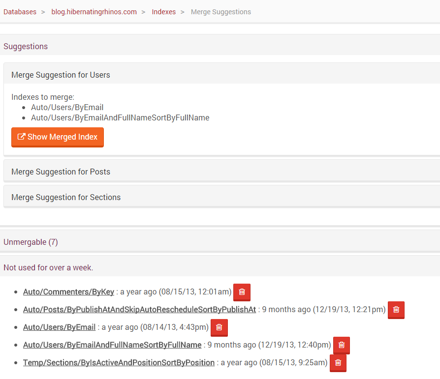
Here is what we get:
You can see that RavenDB suggest that we’ll merge indexes, so we can reduce the overall number of indexes we have.
We can also see recommendations for deleting unused indexes in general.
The idea is that we keep track of those stats and allow you to make decisions based on those stats. So you don’t have to go by gut feeling or guesses.
More posts in "What is new in RavenDB 3.0" series:
- (24 Sep 2014) Meta discussion
- (23 Sep 2014) Operations–Optimizations
- (22 Sep 2014) Operations–the nitty gritty details
- (22 Sep 2014) Operations–production view
- (19 Sep 2014) Operations–the pretty pictures tour
- (19 Sep 2014) SQL Replication
- (18 Sep 2014) Queries improvements
- (17 Sep 2014) Query diagnostics
- (17 Sep 2014) Indexing enhancements
- (16 Sep 2014) Indexing backend
- (15 Sep 2014) Simplicity
- (15 Sep 2014) JVM Client API
- (12 Sep 2014) Client side
- (11 Sep 2014) The studio
- (11 Sep 2014) RavenFS
- (10 Sep 2014) Voron


Comments
I love the idea of this feature. As a minor comment, the "squeeze" icon would not be intuitive to me in this instance. I would see it as collapsing information, zooming out, etc. and so wouldn't expect that to be related performance suggestions. Something like a lightning bolt ("lightning fast") would be less likely to be confused with other functionality commonly used by that icon, IMO.
It has been really exciting to read about the new updates to RavenDB. You're doing fantastic work over there.
I agree with Sean but in my opinion, a bulb icon will fit better for this feature than a a lighting bolt icon.
@Yogesh, I like the light bulb idea better, too. Forgot about that one. :)
Just use this classic as icon:
http://www.istockphoto.com/photo/turbo-button-37812118
;)
I'm going to chime in with @Sean for operations such as this you should not be using an icon at all. The button should be a word, or it should be under a menu with words.
You can't rely on a button having a hover tooltip either, what if the person is using a touch device? There is no hover in touch.
On the same image you posted I see 3 buttons I have absolutely no idea what they would do. The purpose of icons aren't to create new concepts for users, they're give users a visual cue for an already clearly defined concept. The delete trashcan icon is a good usage of this. The usage of the magnifying glass AND query text is good. You could have used the magnifying glass alone and it would have been wrong.
Comment preview