Peeking behind the curtains: The new RavenDB Management Studio
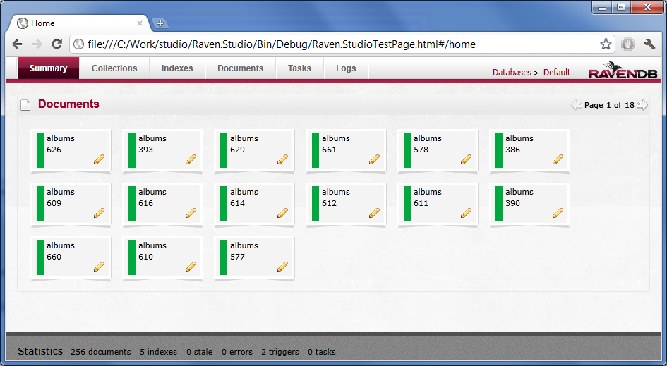
We did a fair amount of work on this, and I think that it is much nicer. Take a look at the home page:
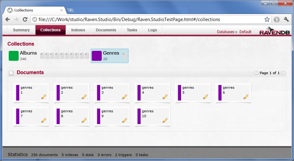
And collections:
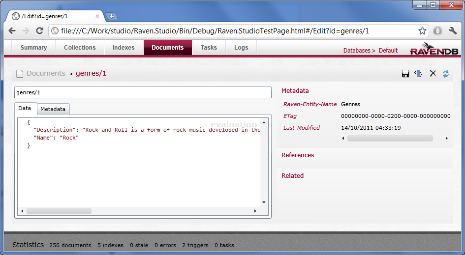
The document edit UI was also improved:
Those are just cosmetic changes, so far, matching the new look and feel of the upcoming RavenDB site and freshening things up.
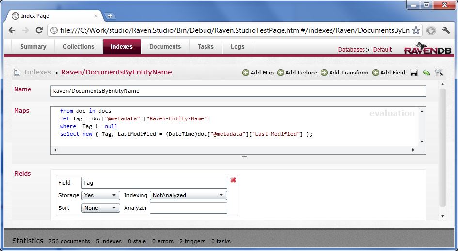
We also implemented a bunch of new features. Here is the new index edit page, which gives you access to the full power of RavenDB indexing system.
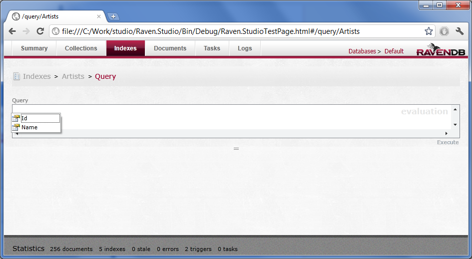
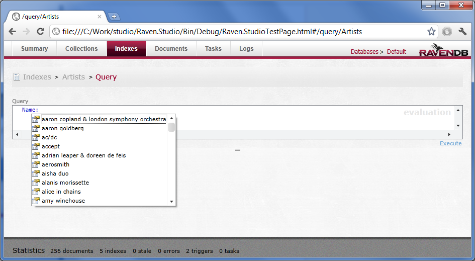
Let us see something that is significantly cooler, we implemented intellisense for querying:
Now you can get queries much more easily, because this will actually look at the database data and suggest the right items to you.
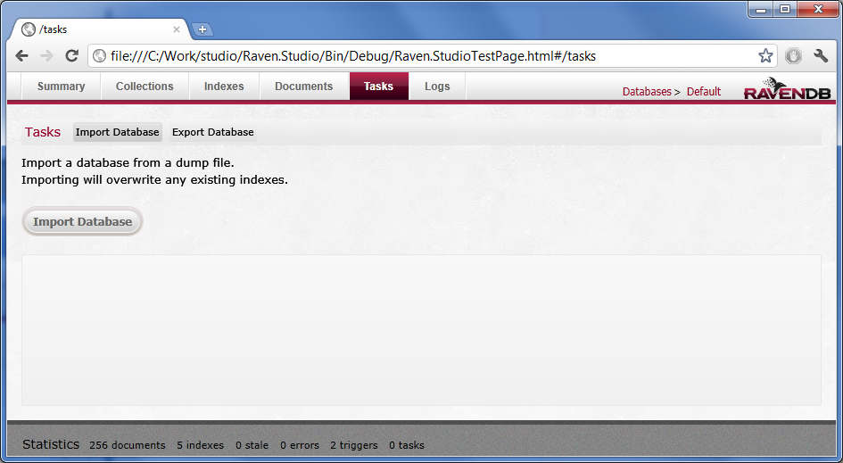
For operational support, we have import/export directly in the management studio:
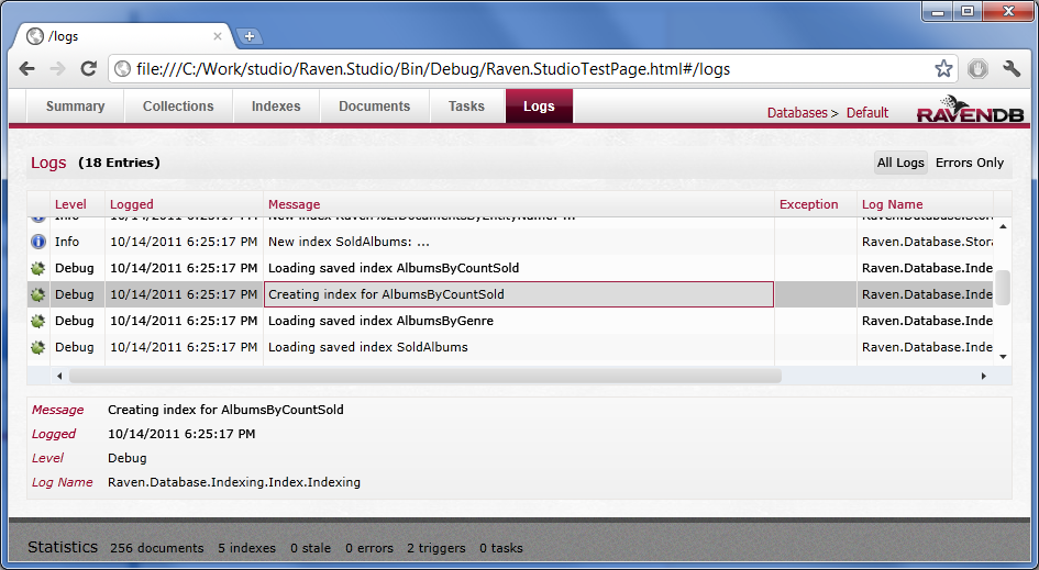
And more about operations, we export the recent log entries directly in the UI, making it very easy to figure out what is actually going on:
Well, what do you think?


Comments
Looks great. When will this be released?
Matt, soon :-)
Which intellisense/highlighting component are you using?
I like it. However, I think there are some issues with the collections view. I would recommend doing a little more work on the "tabs" in the collections view. I'm not sure that the document quantity visualization works when it's laid out like that. You could probably just use the number. Also, you might want to do some styling on that so I can tell that it isn't a horizontal list box ;) Also, make sure those "tabs" look ok when you have more like one or two dozen collections rather than just two. You may find that putting the collection list back on the left (vertical) works better in the end.
Josh, we used the Acti Pro control http://www.actiprosoftware.com/
Great stuff! Looking forward to seeing it in the wild, it's just a matter of getting our system ready for production now! I must say, I'm very impressed with the product, however, I was just wondering, do you plan so slow down your release cycle at any point? I'm not suggesting that would be a bad thing by the way.
Matt, Yes, we are actually doing a lot of stuff around maturity rather than adding a lot of new features.
Rob, If you have several dozens collections, that is a separate issue :-) I am fine with the UI making things hard on you at that point. Vertical splitting means that you are losing a LOT of space when you are presenting, which is something that I would like to avoid.
We don't really consider this to be tabs. This isn't final, though, so we will probably have additional tweaks there
True. Several dozen collections would be ... questionable. However, it seams that 6 - 8 would not be uncommon and I'm not sure that the UI would work in that case, especially if you keep the "doc quantity viz" One thing you could do, if you are concerned about horizontal space for presentation purposes would be to provide a little button in the toolbar that lets the user toggle from horizontal to vertical view. This would be really easy to accomplish by using a DockPanel and databinding the Dock property on the collection list to a toggle button which would change it from Doc=Top to Doc=Right.
Looks great, much better than old one. Hope caching issues are also resolved in new Mng UI!
A bit off-topic, I know, but it looks like you're still going for WPF/SL... I could tell from the lousy font rendering (not to be taken personally).
Just wondering if you'll be sticking to it in the future...
G, Yes
What I would like to see is a delete-by-index feature. It should tell you how many docs are going to be deleted and maybe show those docs, before confirming the delete - maybe this can be done from the query page.
Tobi, One of the point of the new UI is the ability to do those sort of things more easily.
Nice. A big improvement in terms of UI. I actually liked the old html ui because it was very responsive and fast even though it was low on functionality. I understand why you are using silverlight. One of the main problems with the SL version is handling large amounts of data which the html version was very good at. You just need to make sure it is as quick and responsive as the html one and I think it'll be great.
Ok, looking forward to it. If it's that easy, I'll provide a pull request for the delete-by-index feature, as soon as you've pushed the sources :-)
I like it a lot. The design could easily be improve. Lots of different fonts and styles makes the page ugly and hard to scan. The action icons look dated too. Flat monochrome icons would be cleaner.
I like the simplicity of the design. It's possibly a bit "webby" and could be more "app" like. For instance, wouldn't you want a database browse tree for multi tenant situations (like SQL management studio - although that may be something you are trying to avoid being associated to).
Out of interest, why did you choose to use Silverlight?
Not having played with RavenDB, that url looks interesting (especially the file:///). Is that backbonejs? Or is this Durandal that Eisenberg talked about.
Ryan, The file:// is just an aspect of me having run it in debug mode, it is actually hosted inside RavenDB.
Jonty, Using Silverlight allows us to make use of a lot of code we already wrote. It makes it really easy to write the app and work on. It also make it possible to use ReSharper.
Interview with Ayende Rahien: http://community.devexpress.com/blogs/seth/archive/2011/03.aspx
Much nicer than the current version which sometimes looks like a working prototype. Http management GUI is a great idea for a database.
I came to this site the other day to comment on how I did not think the management studio needed to be changed, since it looked and worked fine - but I got sidetracked at work and was unable to post my statement.
After seeing these screenshots ...I am very, very glad that I did not comment. This looks extremely impressive!
niiiiiiiice!
Any chance of fixing the bug where every few seconds, RavenDB Studio eats 20MB from your hard disk?
Filip, Yes
OH! I like!
/approved
Awesomesauce!
Cool UI!
Comment preview