


New Rhino Mocks Logo
time to read 1 min | 93 words
Here is a beautiful logo that Romeliz Valenciano has sent in response to my post about advertising Rhino Mocks.

Here it is at 120x90, with the text that I am thinking about:
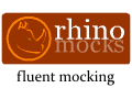
A dynamic mock object framework for the .Net platform. Rhino Mocks eases testing by allowing creation of mock implementations of custom objects and verifying interactions between them.
Update: Updated ad text with Geoff & Sneal suggestions.
Comments
Wow, that's awesome! Fantastic work Romeliz :)
Nice logo. Small typo in text. It should be "Its purpose..". No apostrophe. Also "allowing to create" should probably be "allowing creation of mock..." which would mean changing "verify" to "verifying".
Yes indeed very nice logo.
Good work Romeliz
awesome, want me to add now ayende? just email me and I'll make it happen.
Oooh - I like it!
Awesome logo, I like the tag line "Fluent Mocking"
Nice!
How about change from (w/Geoff's corrections):
Its purpose is to ease testing by allowing creation of mock implementations of custom objects and verifying interactions.
to:
Rhino Mocks eases testing by creating mock implementations of custom objects and verifying interactions.
Love it...
And the tagline "Fluent Mocking" is just GREAT!!!
I like both the image and the watchword.
Nice logo. "Fluent Mocking eases discovering intention"
A nice visual concept. The circled head doesn't look good in 120x90, though. What if the designer made the circled head the color of "rhino" and "rhino" the color of the head? Reverse the colors, that's the idea.
Sneal & Geoff ,
Thanks I have made the change, how do it looks now?
Wow! I love the logo.
But I would omit the tag line. Really. It lessens the visual effect of the picture.
Yes, Sneal's suggestions are an improvement.
Cool logo!
The rhino head is unclear in small size. Maybe thicken it up a bit or change the color as suggested before?
Comment preview